
NEPANTLA UNDERGRADUATE RESEARCH JOURNAL
PRINT LAYOUT DESIGN
THE BRIEF — I worked with the PASOS Network to design the full layout for the second edition of The Nepantla Undergraduate Journal of Faith, Culture, and the Arts, a publication that uplifts undergraduate voices exploring identity, liminality, and justice. The visual system reflects the journal’s core theme of nepantla, or the “in‑between”, through a balance of cultural nuance, bold typography, and accessible, decolonized design that centers students of color and first‑generation experiences.


STEP 1
STYLESCAPE
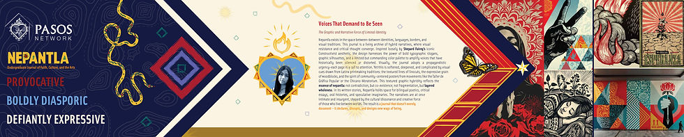
The visual direction for this edition draws heavily from Hispanic creative traditions, especially Mexican printmaking, and incorporates the bold, illustrative energy found in Shepard Fairey’s work. Red became a central accent to distinguish this edition from the inaugural release and to echo the intensity of the stories featured throughout the journal.
The stylescape continues the journal’s established use of abstract supporting shapes, but I reimagined these elements with hand‑drawn brush textures to bring more warmth and tactility. I also redesigned the sacred‑heart portrait containers, giving them a more geometric, hand‑rendered quality that reinforces the edition’s expressive, culturally rooted aesthetic.
STEP 2
ILLUSTRATIONS
The illustrations followed the same printmaking‑inspired style, created to visually strengthen and echo the written stories throughout the journal. I developed these concepts through a highly iterative process, brainstorming multiple directions with the program coordinator to ensure each piece meaningfully supported the narrative it accompanied. Since a lot of the pieces highlighted migration as a key theme, I included monarch butterfly imagery throughout transition pages to bridge these areas together.


STEP 4
THE COVER
The cover was the one area with the least creative flexibility, since the journal was still establishing evergreen branding. To better reflect the illustrative direction of this edition, I replaced the original topographical texture with a straighter, printmaking‑inspired line pattern. I also updated the snake motif, redesigning its pattern with shapes and textures that aligned more closely with the new visual language. I also established updated logo placement that will most likely be used across new editions.